
Dashboard and Visualization Design Principals
Designing a meaningful dashboard or visualization can be a complex and difficult task.
Outlining how best to display data on top of what metrics to track and highlight is a big ask, and doing it ineffectively can diminish the impact of your analytical insights.
This article will walk you through some design considerations and how to go about implementing your very own dashboard.
A Process For Data Visualization
In his book Visualizing Data, Ben Fry outlines seven stages for visualization:
- Acquire
- Parse
- Filter
- Mine
- Represent
- Refine, and
- Interact
These principals are a great starting point for planning a dashboard or visualization.
You must Acquire the data to fuel the dashboard and Parse said incoming data for information through preprocessing. Inevitably this will require you to Filter out anomalies and outliers in the data before Mining the data for further insights. From there, you will then Represent the data to build an initial visualization. You can then Refine the visualization, tweaking metrics, and UX/UI. The final stage in Fry’s framework is adding user Interactivity.
An analogous process specific to designing dashboards is Outline, Acquire + Explore, Design, Back-End, Implement, and Iterate.
Here’s a look.
1. Outline
Before jumping straight into acquiring data, it’s important to definitively ask yourself what questions you hope to answer. Whether it is increasing business sales, optimizing Gross Rating Points, or improving customer satisfaction, ask yourself what data would be most insightful in answering these questions.
Grounding yourself in the problem itself is foundational.
Outlining data that could be useful, even if it isn’t available, or doesn’t exist, can still prove invaluable in wrapping your head around the situation and how you hope to deepen your understanding through data.
2. Acquire + Explore
Once you’ve outlined some initial thoughts, layout an acquisition strategy to get relevant data. Then proceed to explore and analyze said data (Fry’s Parse, Filter, Mine). Many more questions will arise in this process. You may ask yourself, which data matters? What interesting insights stand out?
This is often an intertwining process; data insights will lead to new questions and inspire curiosities regarding new datasets previously unconsidered.
Through all of this, there is also apt to be substantial noise and extraneous information. Remember, while more data improves machine learning models and increases their statistical significance, it does not tell clear and compelling stories.
That is the place of the dashboard—to provide a concise and insightful overview of ongoing shifts and trends. As you begin to explore the data, be mindful of what statistics, analyses, and comparisons speak towards your original goals outlined in stage I.
3. Design
Once some initial data has been acquired and explored, I start by focusing on the layout and design of the dashboard. While this may seem counter intuitive, I find that starting with the front-end anchors my attention on the underlying problem the dashboard is designed to speak to.
Start by looking at some basic plots of the data. You probably already have a few on hand from your initial exploratory analysis. Which speak to the insights you wish to highlight? Which are clear and concise? If you’re looking for further help in selecting a chart type, from Data to Viz aims to help you!
Don’t fret if the first rendition is unpolished. Pushing forward with an initial prototype is part of the process. More feedback, insights, and visions forward will unfold in time, helping direct the process of polishing and refining.
4. Back-End
After you’ve laid out a sketch for the front-end, ask yourself what data needs to be regularly updated to monitor trends. What preprocessing, filtering and aggregations are needed to reproduce those dashboard views? It could be as simple as appending a row of data and updating total sales, or much more complex, like running a text classification model.
Whatever your needs, outline the process and make note of the resources required to produce these views. For larger projects, you may need to further optimize this routine to provide timely updates.
Finally, testing is a recommended safety check for any project. It’s worth taking a moment to consider how you can ensure data integrity and that no errors are introduced along the way. You may want to make sure totals align across two datasets, or perhaps ensure that monthly totals don’t fluctuate by more the 20%. Ask yourself what you would look for if you were auditing the data, and try to devise some tests that can help automate these measures.
5. Implementation
By this point, you should have a fairly clear idea of what you hope your initial prototype to look like, and what steps need to be taken to transform raw data to power that vision. The next step is Implementing an initial prototype. Here are some recommended tools for both the Front-end and Back-end.
a. Front-End Frameworks
The choice of a front-end framework will depend on both your previous experience and needs for customization. Five good options are Tableau, Datawrapper, plotly, shiny, and d3.
Tableau and Datawrapper are good options for their GUI’s and design style, while plotly, shiny, and d3 will be natural translations for Python, R and Javascript programmers, respectively.
Datawrapper provides the least customization, while the possibilities for d3 are limitless. Tableau is formidable and an industry staple but has hefty licensing fees.
b. Back-End Frameworks
Implementing the back-end will consist of three major pieces: the ETL pipeline, a daemon to regularly execute the pipeline (including tests), and a storage format.
For example, you might schedule a cron job that launches a simple script to pull data from an API, perform some data transformations and output a static csv or json file. This routine is surprisingly effective. Even if you have a full-fledged database as well, decoupling this from the dashboard can simplify security and provide for a quick, snappy user interface. (No user database access and no need for AJAX calls.)
For more complex script scheduling and monitoring, Airflow and n8n both provide robust frameworks. If these are outside your toolset, start basic, and simply execute your script using cron.
For storage, you again have a myriad of options. While you will want a database for its many benefits, generating static views from this database is still an effective method for powering the dashboard itself. To do this, you could maintain scripts that update and populate the database, and another that generates flat files to power the dashboard views.
For the database itself, you could use MySQL, PostgreSQL, MongoDB, or even a graph database like neo4j. Managed platforms like AWS, DigitalOcean, and Snowflake are also great options, which provide you a SQL database in the cloud and reduce additional maintenance.
6. Iterate
After you’ve Implemented an initial prototype of the dashboard, it’s time to begin refining and enhancing the first rendition. A good dashboard will undoubtedly include a layer of interactivity, allowing the user to explore the data itself, highlighting information of interest, observing trends, and gleaning insights.
For example, the video below shows 2 dashboard components.
On the right, you can see a scatter plot of market size (Footprint) versus total sales. On the left is a map of the markets corresponding to each of those points on the scatter plot.
By exploring various clusters in the scatter plot, the user can search for geographic patterns that might emerge. The video demonstrates the user first inspecting a small cluster of markets where sales outperform a standard regression model of the data (three points above the line), followed by a cluster that underperforms the generalized model (the two points below the regression line).
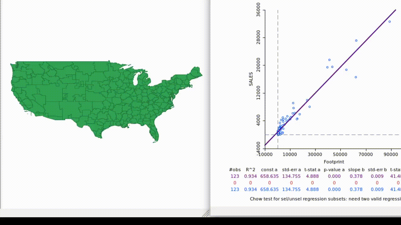
This dashboard also displays a range of other information suited to a technical analyst, including regression statistics relating to selected markets.
As you continue to iterate, you might find yourself running through the entire process from start to finish again. You might reexamine your initial goals of the dashboard, what information is relevant, what you want to display, and how you want to display it.
Conclusion
Whether you’re designing a dashboard to track the Presidential election, your most recent marketing campaign, or your current fitness level, it’s important to keep an eye on the target. Get the data you need and explore it for insights, but remember what purpose that data serves. From there, you’ll need to outline what you want to highlight in the dashboard itself before moving on to implementation details.
As you go through this process, remember that any data visualization project is a process. Start with an initial prototype and iterate, iterate, iterate! Before long, you’ll have a wonderful dashboard before your eyes, and you’ll be able to keep an eye on incoming data in a meaningful way.
See what others are saying
Let’s stay in touch
You may not be ready for us now, but you’ll want to remember us when you are. Enter your email to stay updated on the latest in analytics and our services.